Interactive Corona Dashboard
When the Corona epidemic reached Germany I got interested in the visual representations of the pandemic and was surprised that most awesome of them all, did not have a higher granularity for Europe than just the countries. Since all local medias were quoting the numbers of the Robert Koch Institute, and they provide the numbers in relatively frequent updates in a nice html table, I decided to build my own overview.
The project consisted of three parts:
- Automatically retrieving and storing the data
- Providing an intuitive overview of the spread per state
- Giving insights into the history of the outbreak
As mentioned above, the source was easily identified, so I built a php web crawler to read the table with the most recent numbers and store them. Since I did not want to put unnecessary load on the servers of the RKI and I saw in the prior days that they only update their numbers a few times per day, I decided to trigger the crawler only three times per day, using this free cron job site. This is for sure less load as some individuals put on their site 😛
Since my webhoster also offers a SQL database I was first inclined to use it, but after considering that this epidemic will probably only last a few weeks, I decided to take the lazy route and just store the data in a textfile. If it turns out to continue much longer I might reconsider this.
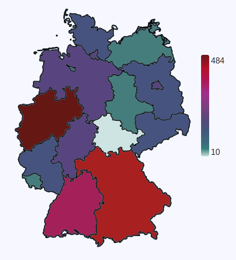
Next step was finding the right map api that reacts on mouseovers and has map data as I would like. Most maps are for navigation purposes and therefore not suitable for this endeavor, but then I found Googles GeoCharts which looked perfect! At least until I discovered that they don’t offer individual states in Germany or Austria.
So I decided to do it the manual way without a fancy API. I used Inkscape and GIMP to create my own map of Germany and each individual State. So on the website you see 17 images stacking over each other. Always just borders or a state, with most of the image being transparent:

While all images are black, I used the CSS filter style to colorize them. It is not intuitively understandable (at least for me) how colors are represented by the filters, but luckily there are great converters like this here. I decided to create 9 shades for our scale, which are slightly exponentially scaled, based as fraction of the highest value.
Great, now we have a static representation which looks already nice, but also quite boring. I used GIMP again to trace all state borders to area maps, so I can react when the user clicks on them, or hovers the mouse over them. To be honest, setting the title element with the name of the states helped me a lot in the development process because since I was not in school in this country, I still mixed the position of the states^^ Here it is important to align the area maps in the right order, so city states are not overlapped by their surrounding states and can still be clicked.
When clicking on a state a graph appears from nowhere and shows how the infection number changed for this area. Since I am fetching data more often than the RKI publishes new data, it has first to clear the duplicates. To display a pretty, animated graph, I use the Javascript libary Chart.js.

As an overview there is now also a table that shows the most recent data for the infected people per state and also the proportion per million inhabitants, since it is no surprise that some states have multiples of infected than others.
And then there was the hardest part: making the site design responsive, so it also looks good on different screen sizes like on a mobile phone. I chose to use Bootstrap since it is super powerful and I had already some experience with it. The difficulties lie in the map and the chart, which include also absolute positioning (at least in relation to the inner elements) and a variable with.
In the end I made a workaround and increase the Bootstrap column sizes on smaller viewports, so it is forced to throw them in a new line before the elements overlap.
Improvements:
- Switching the map between absolute values, and infections relative to the population size
- Adding the values of each state into the title of it, which you can see when hovering with the mouse above it
A typical issue while running the site, was the change in my source data, which is rather common for any data analytics project:
- The table dimensions changed after they introduced also a mortality column
- The names of some states changed after some days (like adding a – to names as Schleswig Holstein)
- Sachsen Anhalt had 0 infections the first days and was then entered in the middle of the table, so I had to change the structure. Would have been easier if I had started with a better database (hindsight^^)
- Irregular frequency. Sometimes the RKI did not update their site for more than a day. But they definitely have more urgent things to do right now 😉
Update: 27.07.2020 – since the RKI kept changing the data source and there are now a billion great dashboards around, I stopped fetching new data from them and therefore discontinue this project.